Take Shot
2019
identity, web-design
identity, web-design
This young, independent creative agency with a focus on film-making asked me to redesign its logo and create a web portfolio.
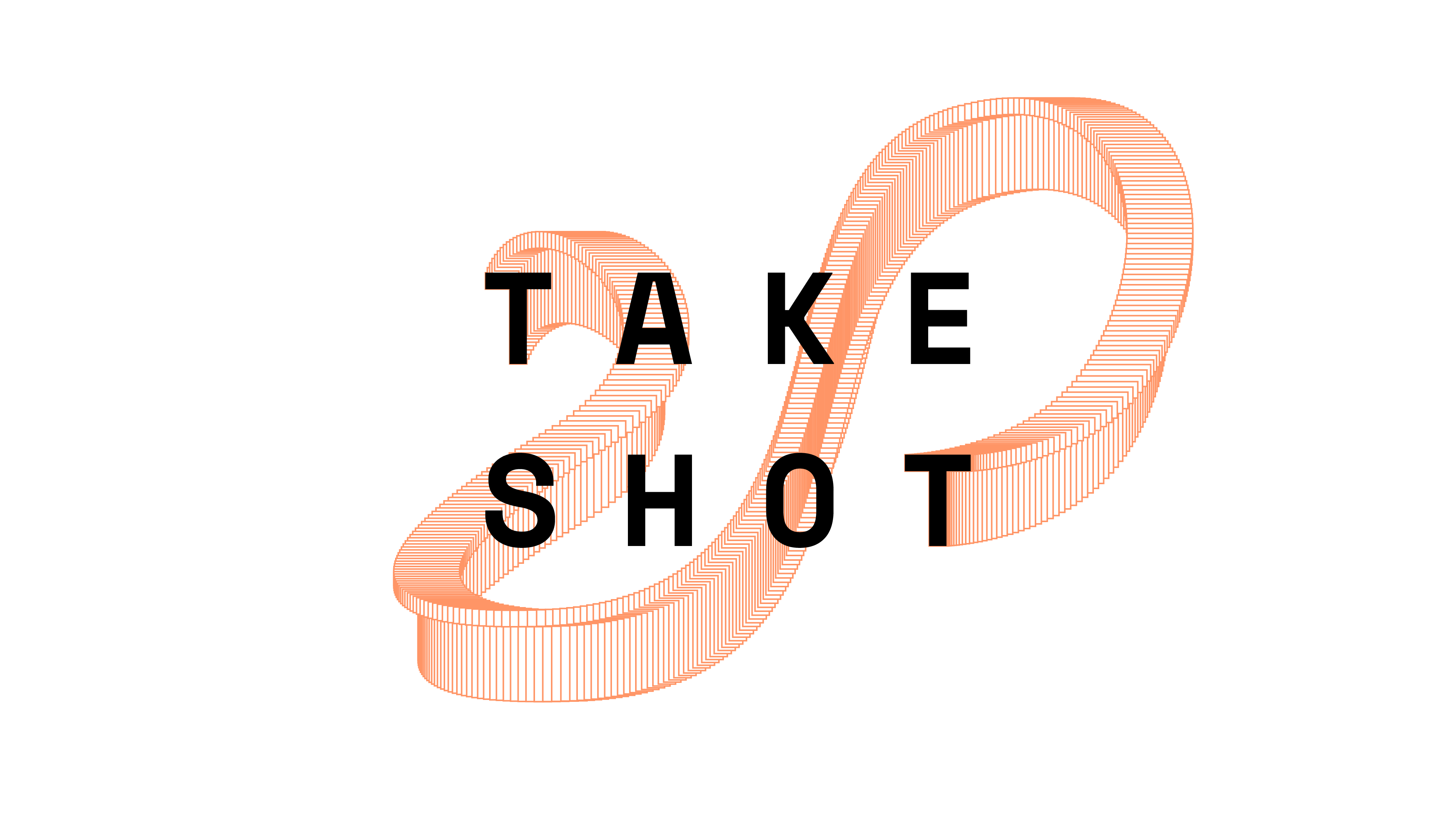
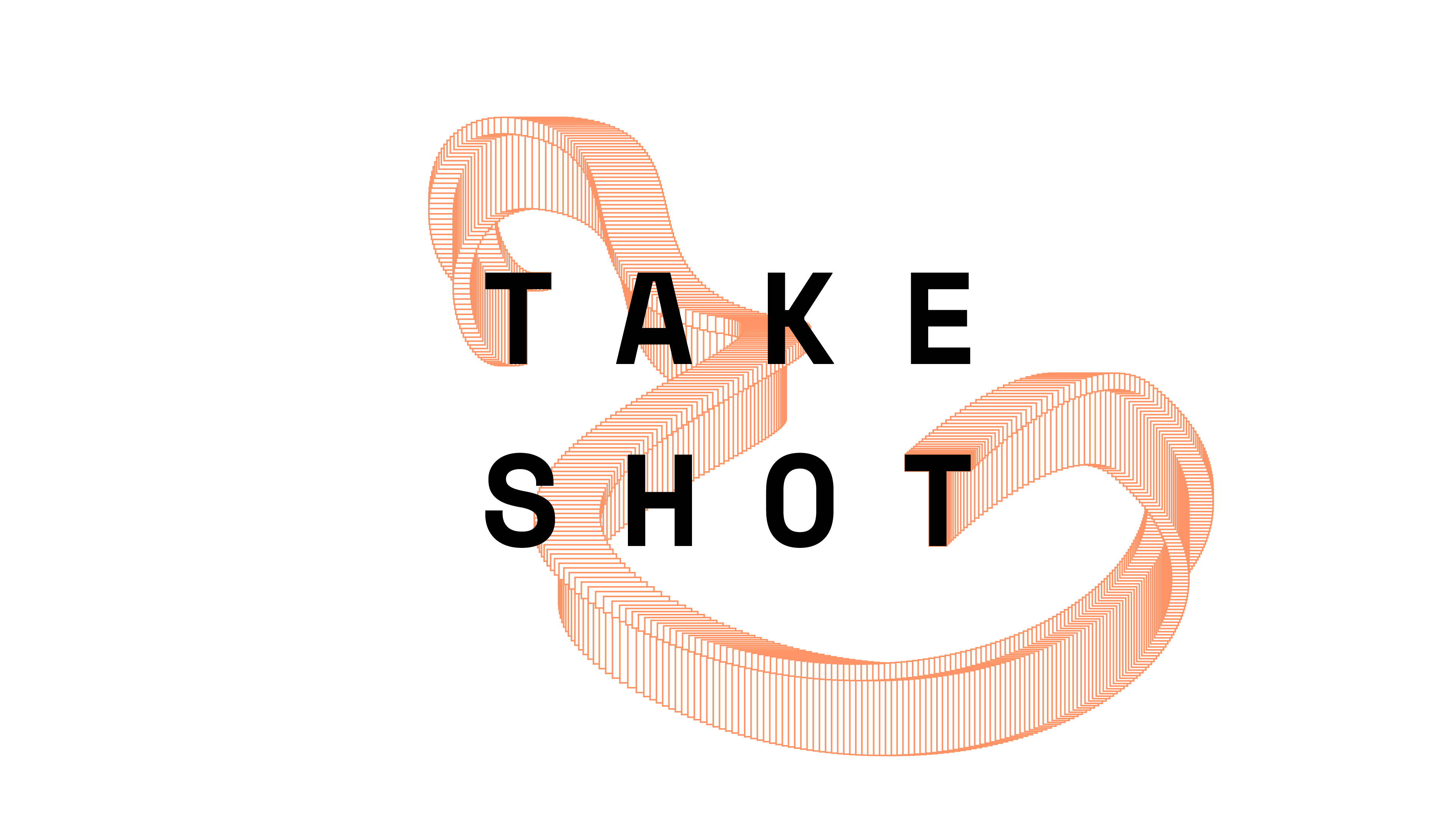
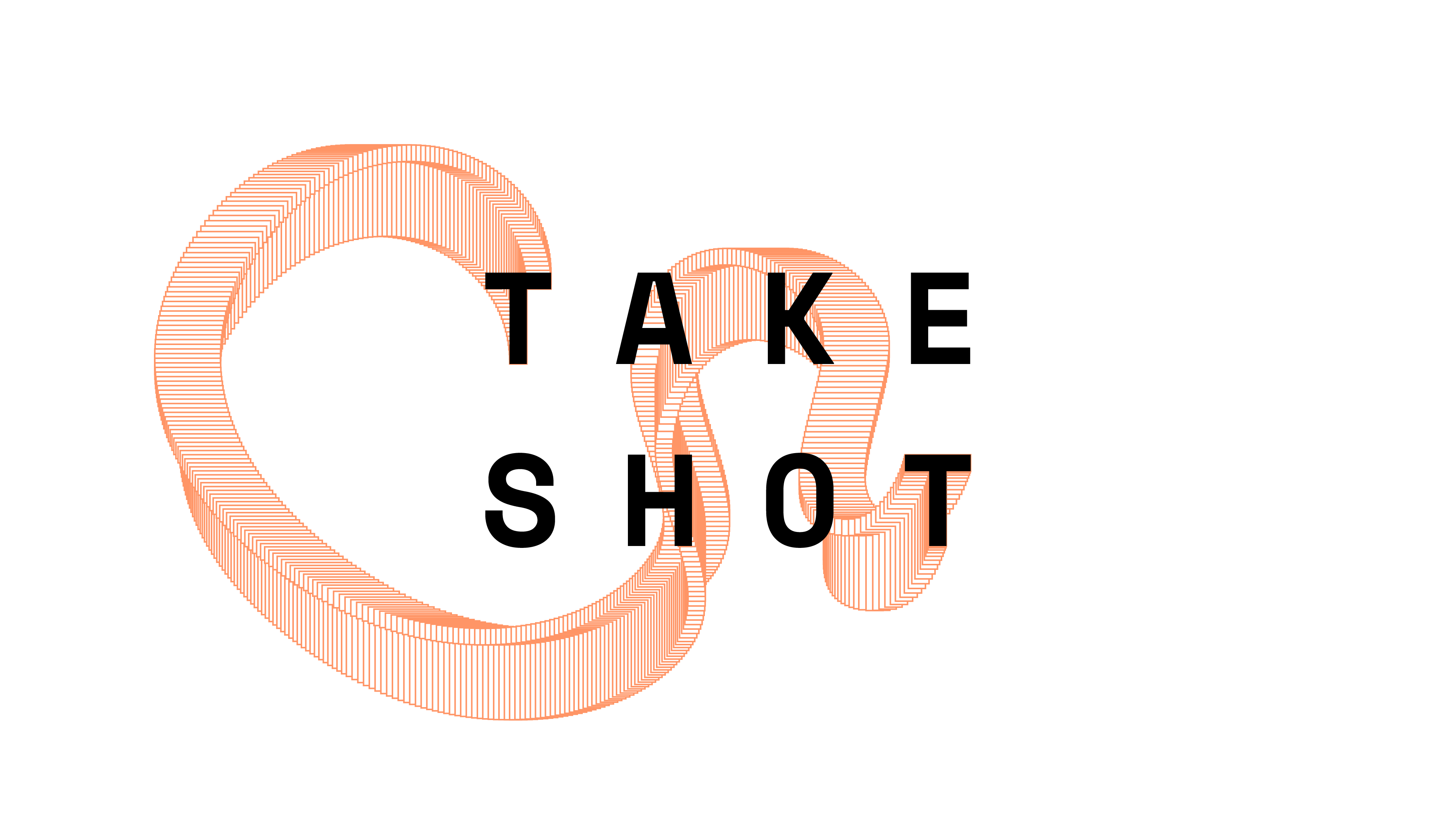
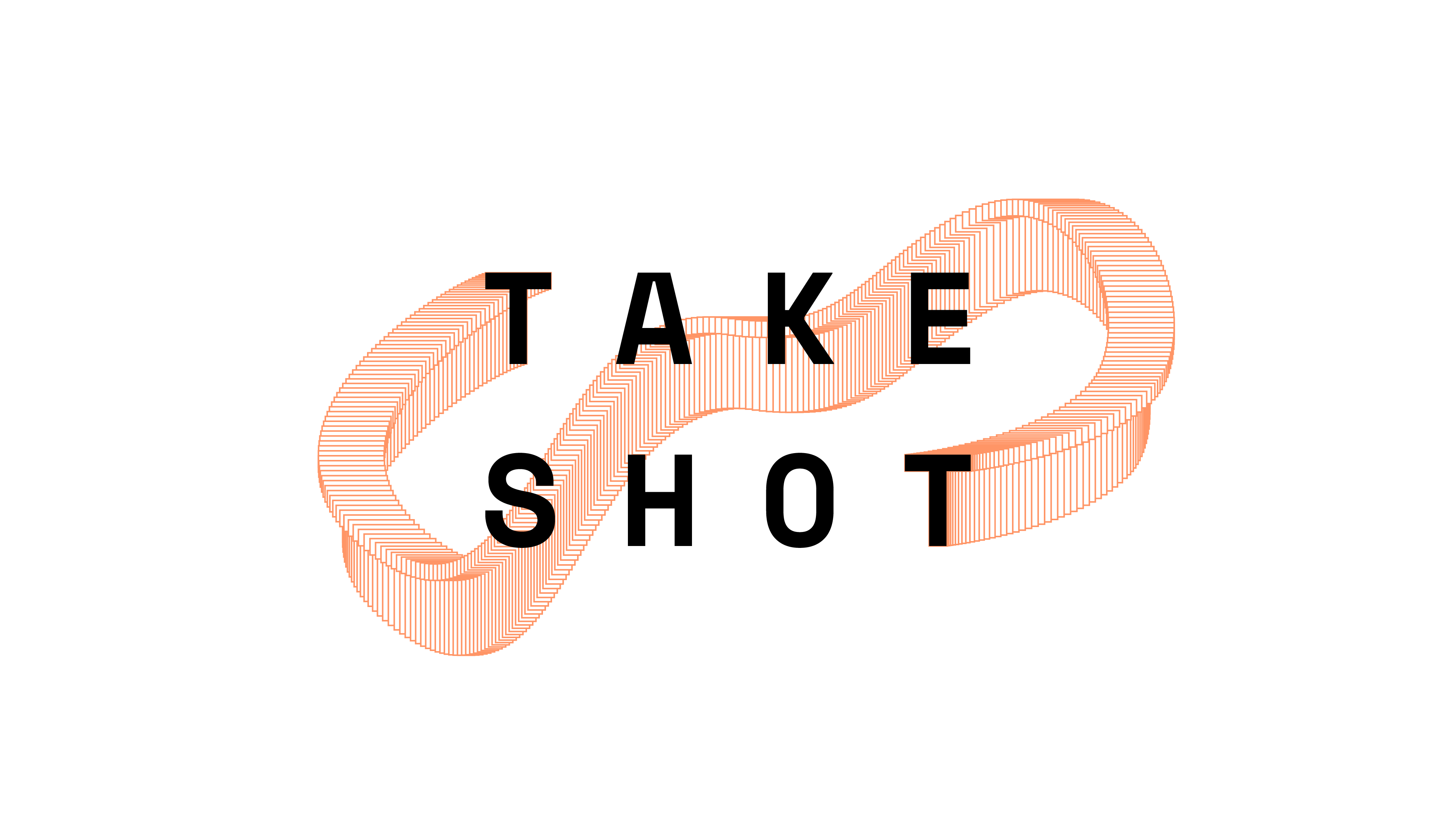
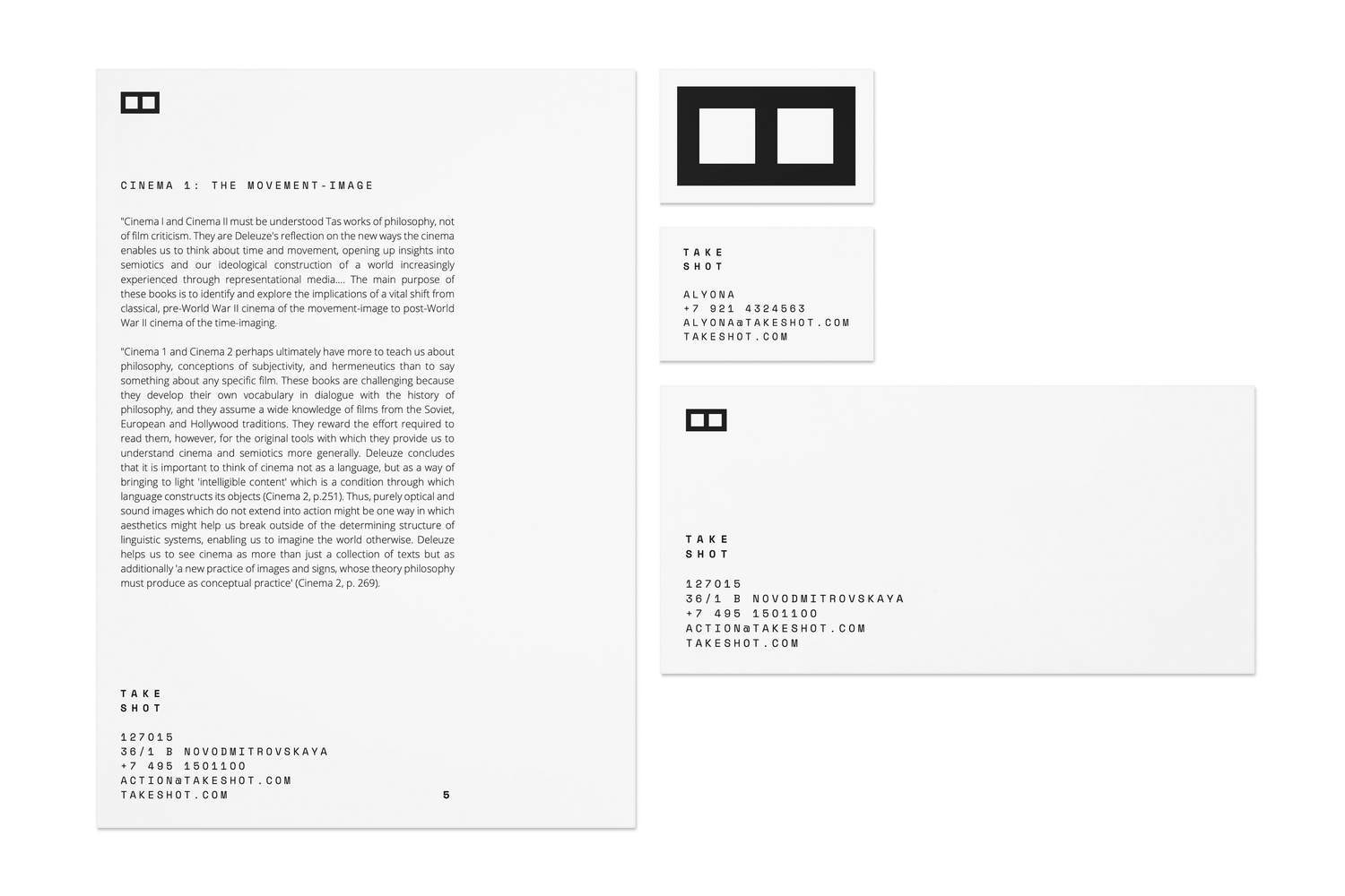
Identity
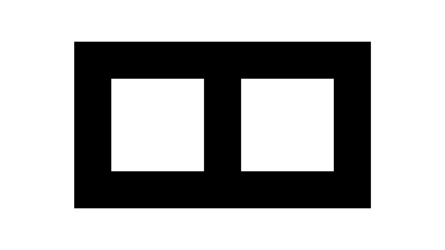
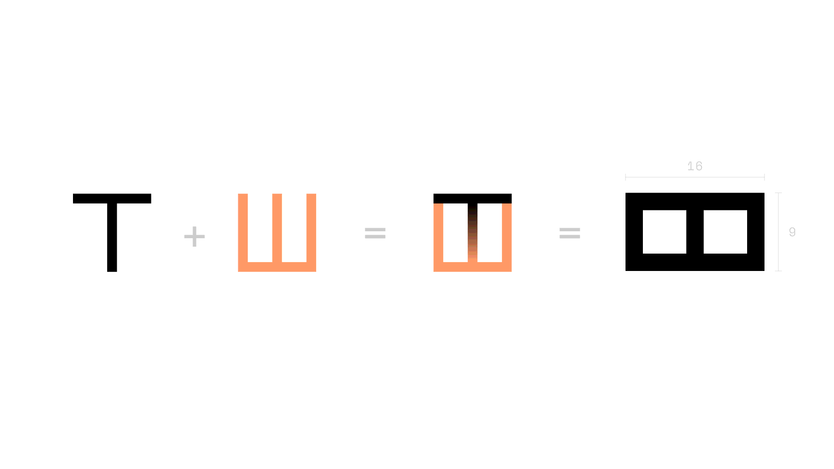
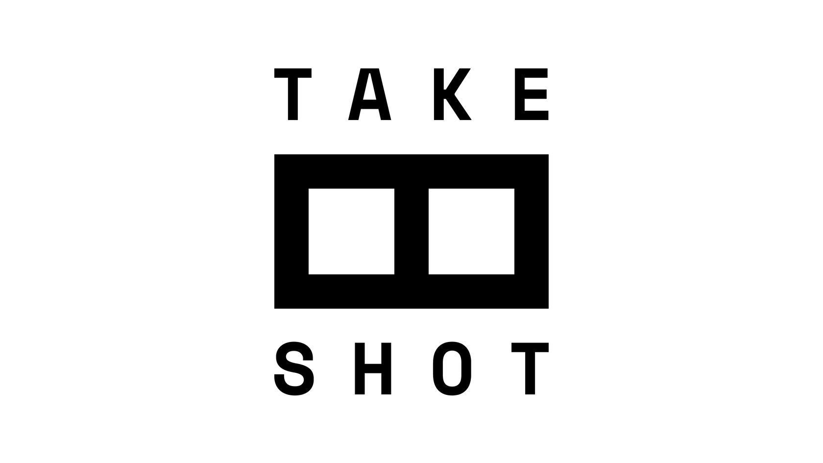
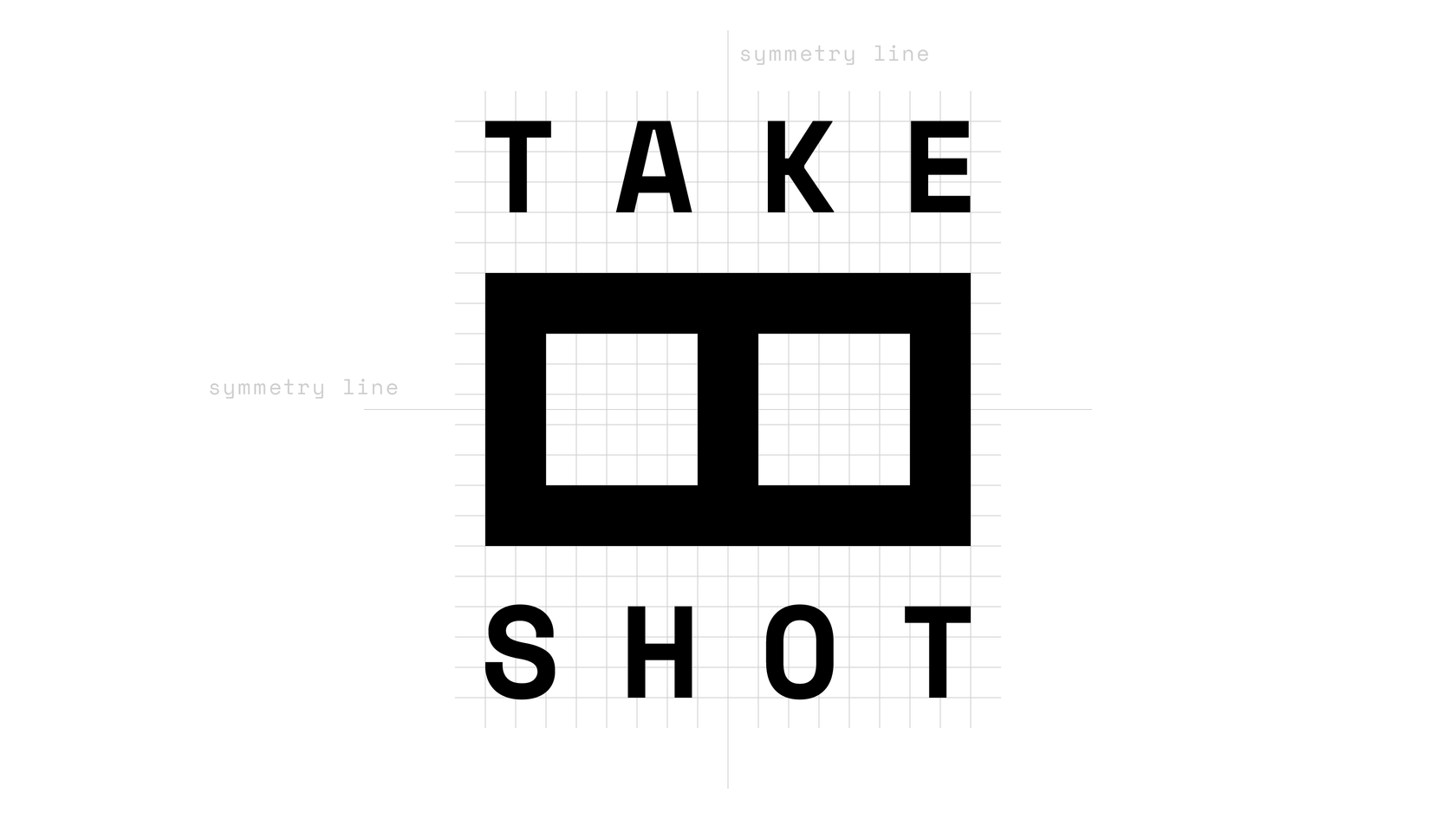
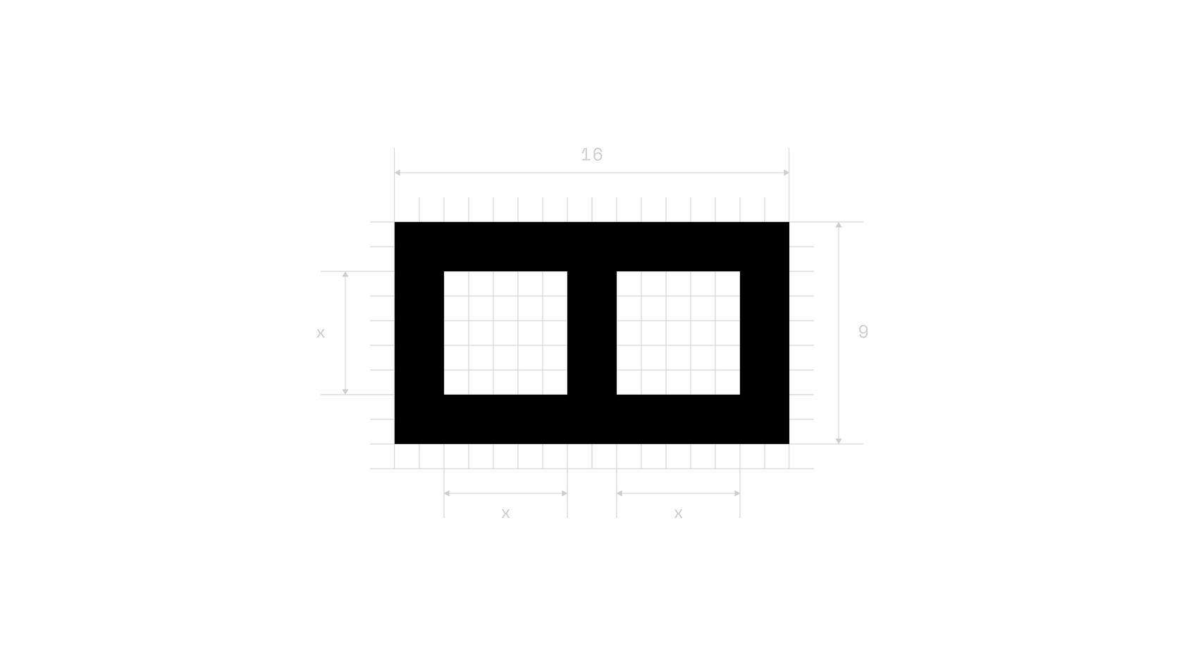
The logo is a graphical intersection of the Cyrillic letters for 't' and 'sh' sounds with 16:9 proportion—the most popular video format.
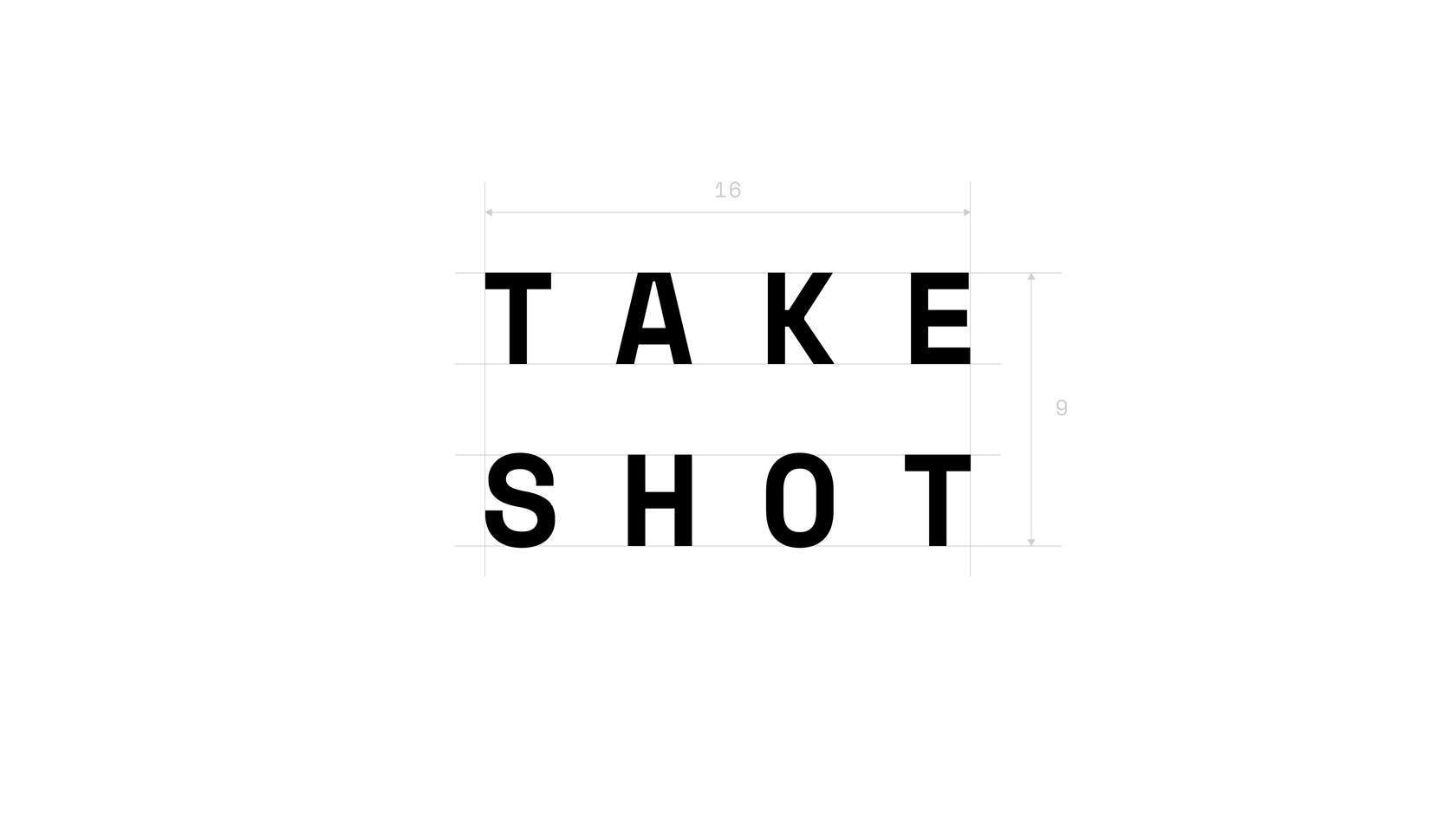
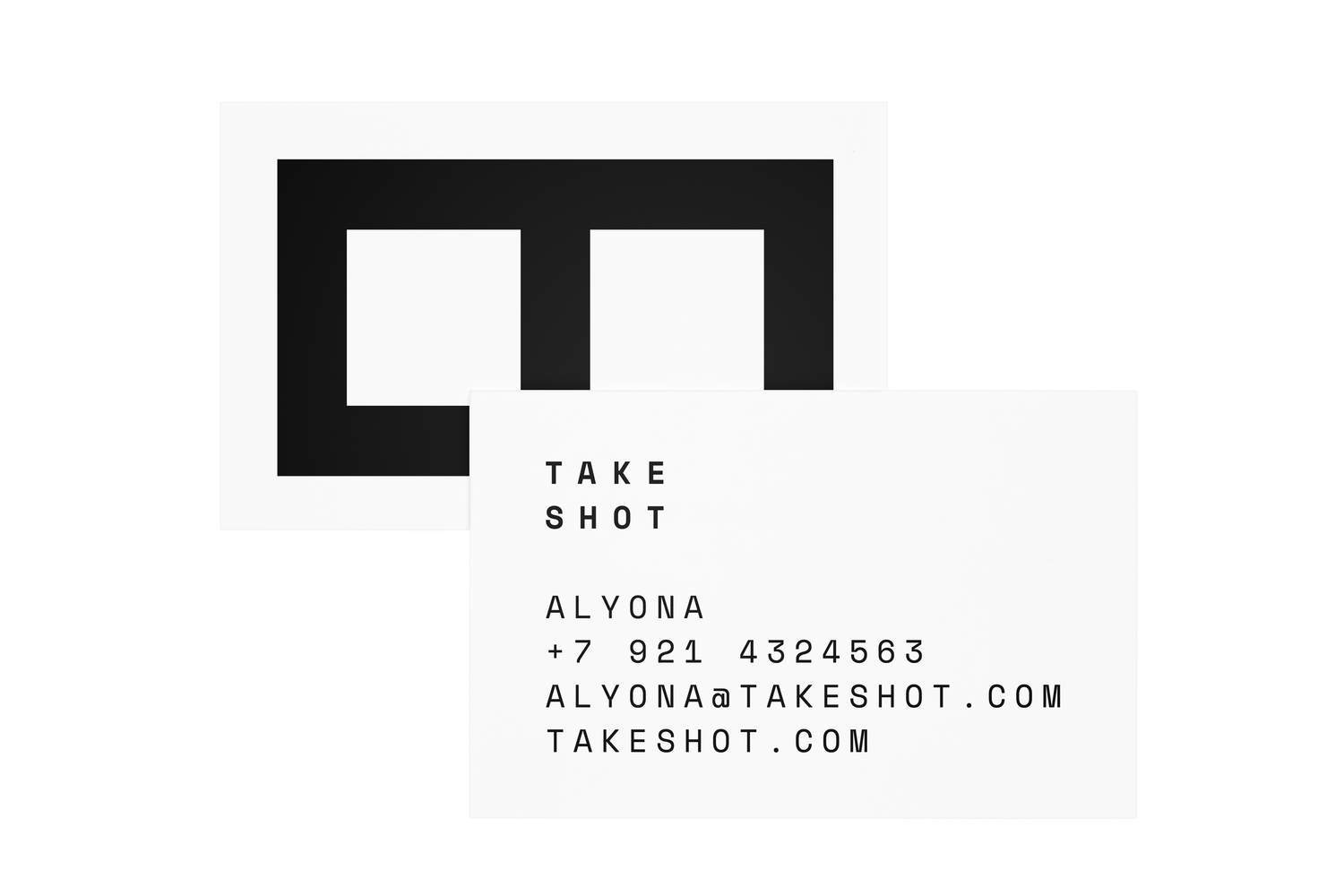
To support the geometrical shape of the logo, a space-style font was used in a straight symmetrical order. The same font is for stationery and headings.
To support the geometrical shape of the logo, a space-style font was used in a straight symmetrical order. The same font is for stationery and headings.
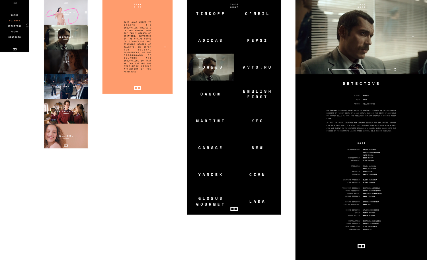
Portfolio
The portfolio is designed with visual elements that represent its focus on film. Project descriptions appear as final titles, the hamburger menu turns into a clapperboard that claps when you click it, and hovers are animated as cinema showcase lamps.
The symmetry of the logo is reflected in a back-and-forth sequence of project preview videos and the portfolio is optimised for mobile, tablet and desktop screens.
The symmetry of the logo is reflected in a back-and-forth sequence of project preview videos and the portfolio is optimised for mobile, tablet and desktop screens.
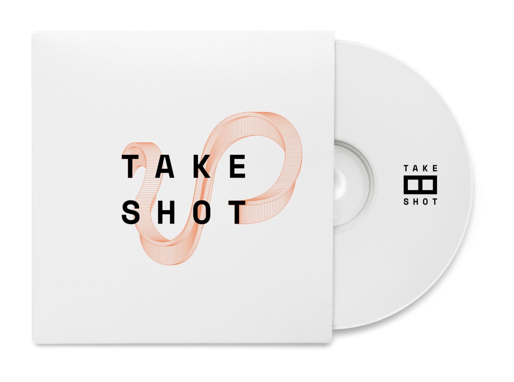
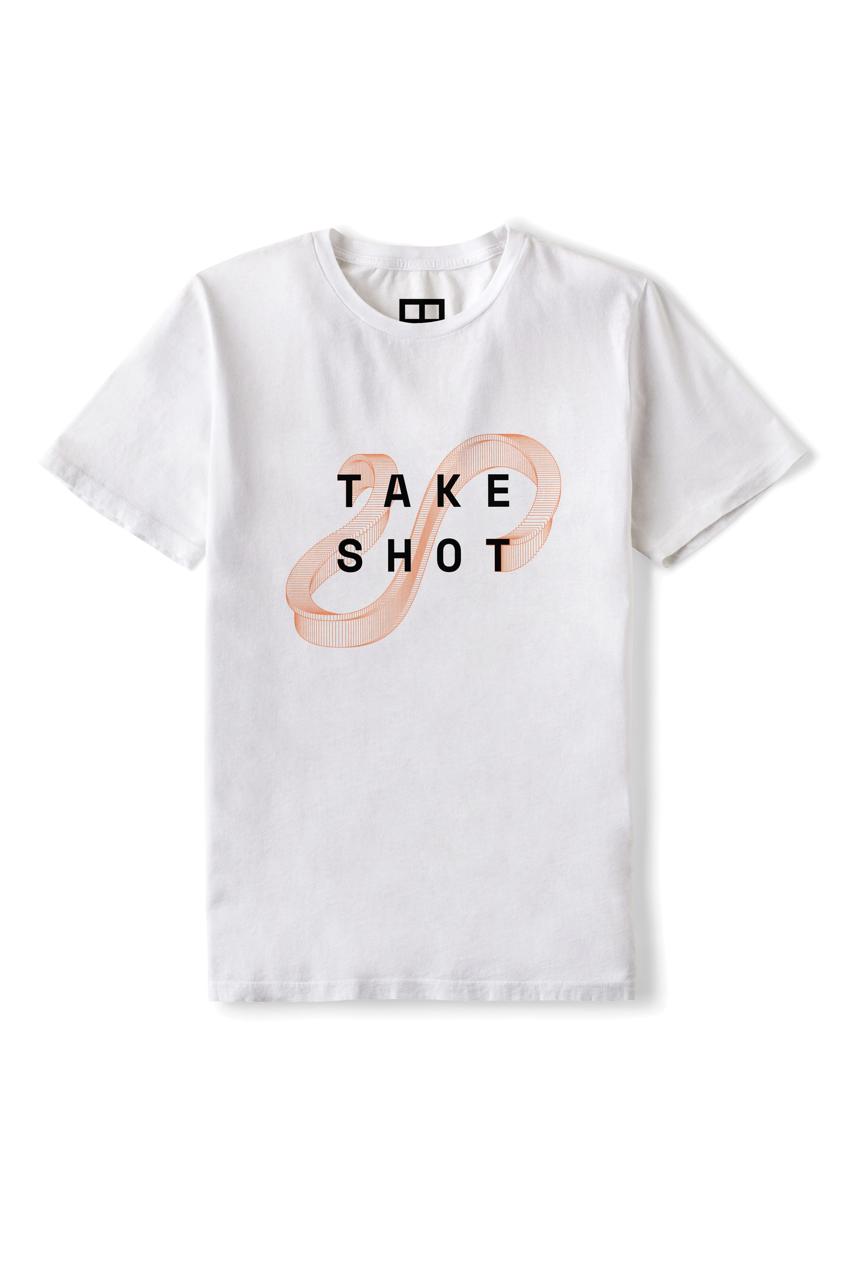
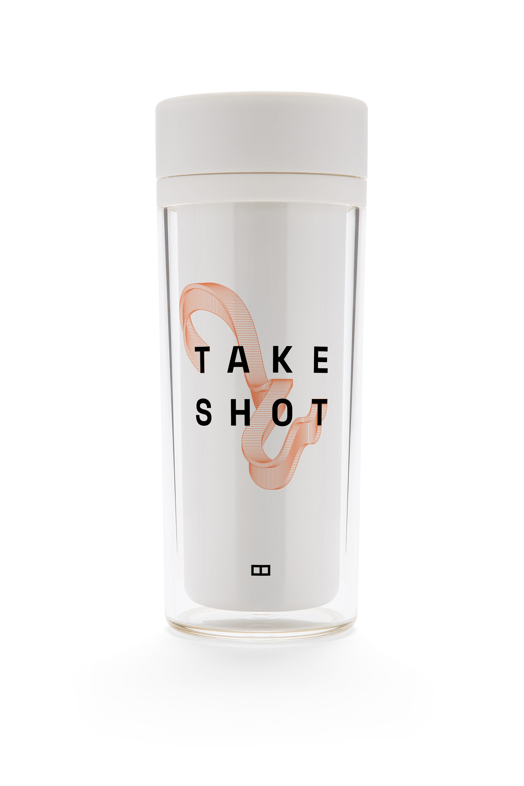
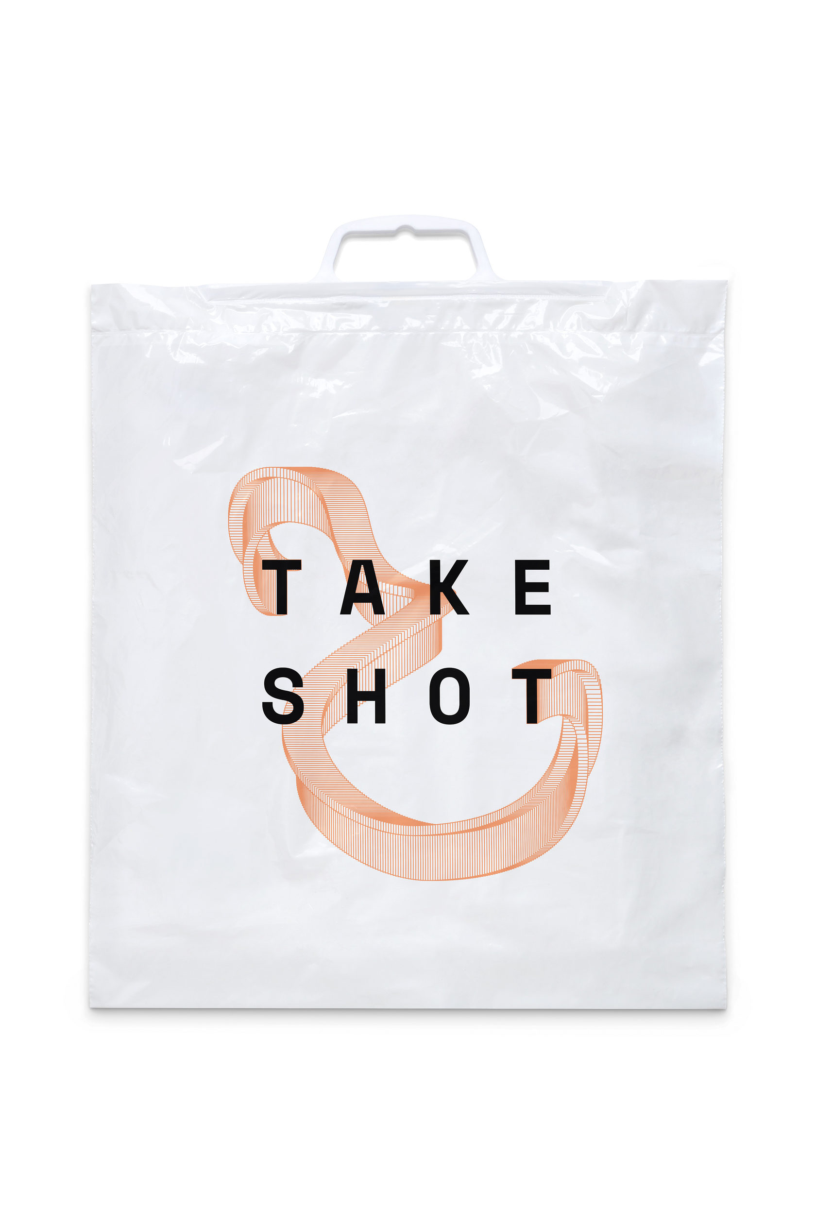
Swag
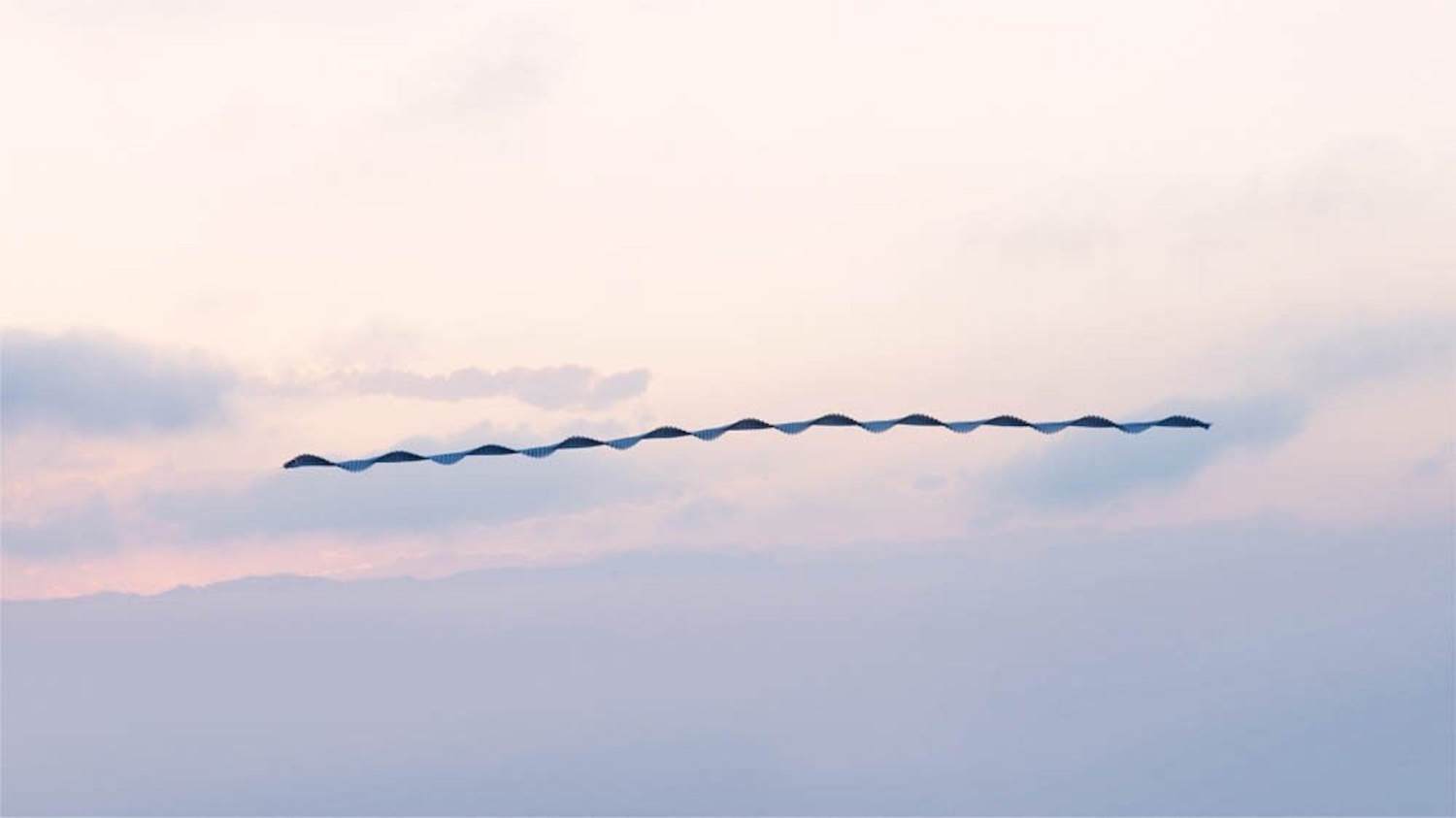
Visual identify for merchandise is based on the idea of following the path an object leaves in the time-frame of a shot. The company name—Take Shot—starts and ends with the letter 'T'. Reading the name, the letter 'T' seems to move from the first to the last place in the name, similar to a film shot in which an object moves during a certain time-frame. An image of a bird taken by Xavi Bou further expresses the idea of an object in motion. The versatility of this concept means that it can be used to generate a vast number of unique visuals while maintaining the central element.