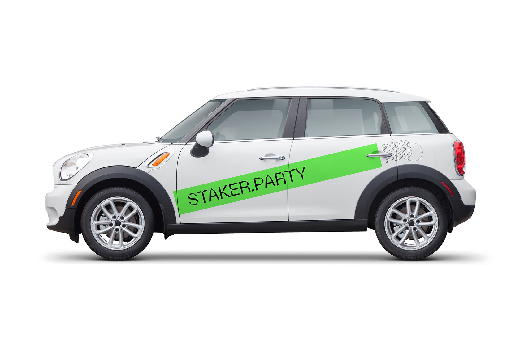
Staker.Party
2021
Identity, product design
Identity, product design
Fakecheck is an independent Russia-based service providing a tool for factological review of any article or publication in mass media and on social networks. First-alike service provides manual research according to a professional community-developed algorithm and evaluates publications with a fakemeter scale from entirely true to completely false. My task was to create an identity, develop proper UX flow and build a ready-to-launch version of the product.
Identity
The initial concept was to make Fakecheck look less like a mass media tool and more like a service. In order to do that, a dynamic brand character was developed. Together with clear typography, the character forms a recognisable and distinctive logo. It's playful and scalable. The character is made up of a combination of quite dissimilar images: a finger – a symbol of reading text carefully line by line; an all-seeing eye – the one from whom it's hard to hide the truth; and a full face mask, or balaclava – an item with quite a rebellious feel. It's a postmodern approach, let's say.
Colour & Typography
The colour spectrum on the fakemeter scale runs from red (fake) to green (true) with yellow (50/50) in the middle. Blue is an off-scale colour, a symbol of neutrality and impartiality. It's digitally bright and truly sharp. The background colour is newspaper black – the dark grey colour of newsprint.
Two fonts were used in the design: Source Serif is mainly for headings and parts of articles reviewed by Fakecheck (e.g. source materials), and Din is for review results and service information (e.g. internal messaging).
Two fonts were used in the design: Source Serif is mainly for headings and parts of articles reviewed by Fakecheck (e.g. source materials), and Din is for review results and service information (e.g. internal messaging).
Product design
Fakecheck came to me with a well-thought-out and thoroughly researched idea with solid product and marketing analysis. Moreover, they had a strong minimum viable product (MVP), which allowed them to test the service prior to a large-scale launch. That meant my task was to review all of the findings and build the launch version with clear messaging and an intuitive, easy-to-use interface.