Centrifuge
Product, visual, identity
2018–2021
Centrifuge is an open, decentralized platform to connect the global financial supply chain. It allows any business to transact while maintaining ownership of their data, including validated company details, business relationships and transactions.
Identity DNA
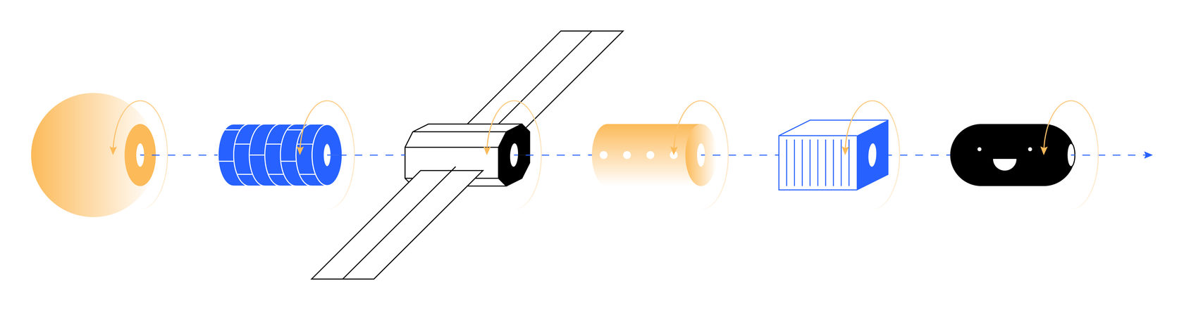
Brand identity is critical, so I was tasked with developing a new visual language for Centrifuge, starting with reworking its logo to better reflect its values. I maintained the integrity of the original logo while optimising its proportions and visual impact. Once this was accomplished, I built visual elements to support the new identity, implementing a four-colour palette based on the co-founders' original vision. I was able to capture the metaphor embodied in the logo by designing a set of multi-dimensional rotations, whose intersection brought up the magic.
Product design
As product designer, I created an experimental environment to enable the team to work on MVP and further product development, ensuring that design is an ongoing, organic process. This aspect of the work required me to conduct research on blockchain technology, financial supply chains, and invoice transfer and apply that knowledge to making new tools. One of these was a product, similar to a standard online invoicing app, that uses blockchain tracking flow, thus making innovative technology accessible and inviting. Products were designed in such a way that, in addition to being immediately functionally, they also allowed the team to do ongoing experiments with modules and processes.
UX
Though UX on this project is subject to a non-disclosure agreement, I can say that the product design passed all the UI/UX stages, starting from user persona definition and UX flows to Invision prototypes and usability test. We defined three user groups: customer, supplier, and admin, as someone had to manage this novel business-to-business process in the early stages. Together with the product manager, I worked with the team to define user goals and task flows for all groups. Based on this information, we developed a common product user flow and flowchart for each group. Using the design system (see below) to avoid wireframing, I created the first product prototype and subsequently created Invision prototypes for primary functionalities and to test with users. The product had to pass nearly 10 design circles before launch. Each circle helped to define a particular problem and modify the product structure to highlight essential use cases and values.
Design System
The design system is key to developing other products, and allowing the rapid innovation the business requires. I built it based on a library of react-based framework Grommet, to allow faster development iterations and enable us to skip wireframing. I designed the basic elements, along with the grid system and scaling rules, using the library of Sketch smart objects This design system was used for the product UI and homepage design to maintain Centrifuge's visual style.
Homepage
The visual identity and Design System rules were transmitted in homepage design. Each shape was assigned to a sub-page as an identical element, then animated and converted to JS code for easy integration. The design system and guidelines allowed easy scaling of the Centrifuge homepage to mobile, tablet and desktop screens.
Illustrations
Centrifuge offers a huge knowledge base about blockchain for financial supply chain systems. The team regularly publishes reports and research on Medium, explaining the innovative product to potential clients and inviting industry collaborations.
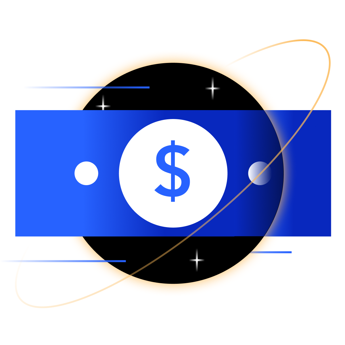
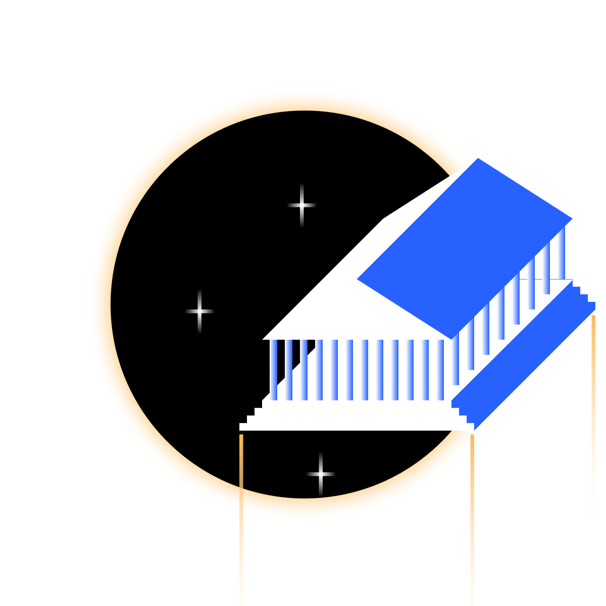
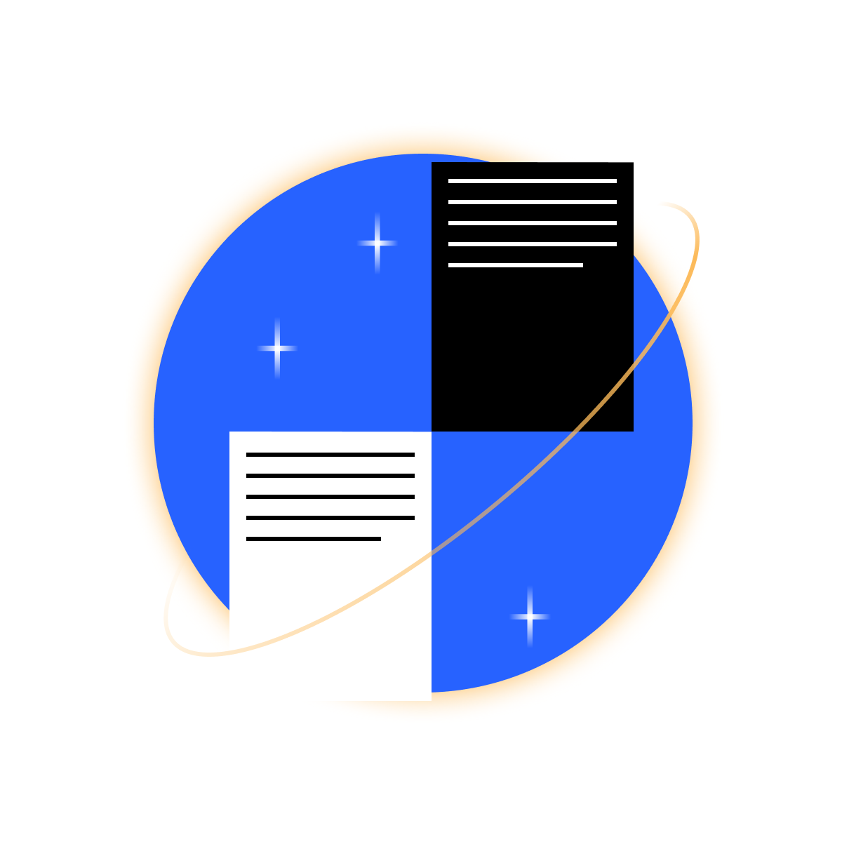
Articles are illustrated to enhance visual appeal. I developed the brand aesthetics into a distinctive style that now recognised and beloved by the blockchain community, which calls it 'Centrifuge art'
Articles are illustrated to enhance visual appeal. I developed the brand aesthetics into a distinctive style that now recognised and beloved by the blockchain community, which calls it 'Centrifuge art'
Icon Set
The umbrella concept for Centrifuge graphics was to mix different grid-based graphical elements, e.g. line art, flat-style, gradients, so it seems a tornado rotates everything together. This created a unique icon set for web page, presentations and explainers.
Whitepaper
In addition to UI/UX, web and graphic design, I created a template for a white paper. My solution was to make it as simple as possible so the team could add or edit information in digital or print. It was designed in the same style as the visual identity, with additional infographics and charts.
Infographics
As a financial services company, infographics, charts and explainers are absolutely essential for Centrifuge. Implementing the four-colour rule, and using the design system and brand identity principles, I developed a range of visuals that run the gamut from quirky and creative to formal and informative. These can be flexibly adapted to a variety of internal and external uses, ensuring strong visual continuity.
Tinlake
To spread ideas across different business areas, Centrifuge launched the products Deep Tier Finance, Leaf Capital and Tinlake. My job was to create a new identity for each, while maintaining the same-family appearance.
Tinlake Product Design
Tinlake allows the user to tokenise real-world assets and leverage them to access loans in a decentralised finance ecosystem. Its web app allows the user to track activity in the ecosystem, and has to be straightforward and informative.
Crypto
One rewarding aspect of working in blockchain finance is the opportunity to design logos for currencies that may become as famous as Ethereum or Bitcoin. I designed the brand identify for the following:
RAD (Radial): Centrifuge cryptocurrency represented by an R formed by two radii.
NFT (Non Fungible Tokens): represents interconnection of participants in a chain.
CVT (Collateral Value Token): blocks are connected in non-existing dimension, digital one.
Tin, Drop and ERC 20 are the tokens of common Tinlake ecosystem needed to convert NFT contract to Stablecoin investment f.e. DAI.
Lucas Vogelsang
Stas helped us come up with a great visual language for Centrifuge and built out our library of design tools to include website, print materials, user interface design and illustrations. He constantly plays with form and colour to create designs that stands out.
Centrifuge
CEO
CEO
Maya Byskov
My name is Maya Byskov. In my career as a curator and project manager for large international cultural institutions and start-ups, I have worked with many designers over the years.
Stas joined the Centrifuge team early on and was instrumental in creating the visual language for our brand, at once serious, sophisticated and playful. Stas is a fantastic art-director, able to translate complex technical topics into visually simple stories, and has developed a library of design tools including website, print materials, user interface design and illustrations.
Stas has been a reliable team player, fun and visually adventurous. Would love to work with him in the future!
Centrifuge
Sustainable Finance Manager
Sustainable Finance Manager